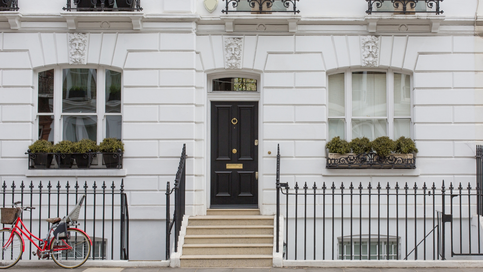
Investment update – 14 Eaton Square
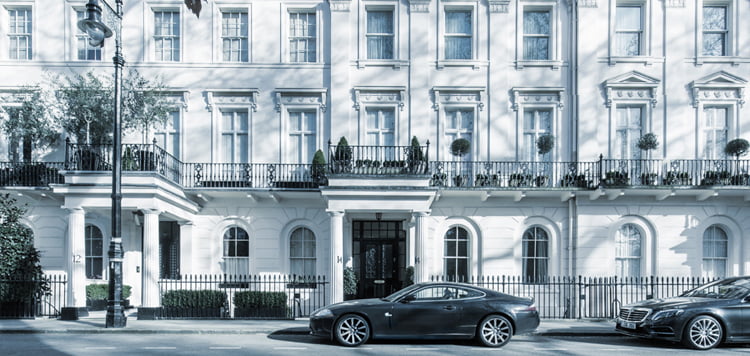
14 Eaton Square
At CapitalRise we are passionate about investing in the finest quality real-estate on behalf of our investors.
We are excited to share that works are now complete at one of our previous investment opportunities 14 Eaton Square
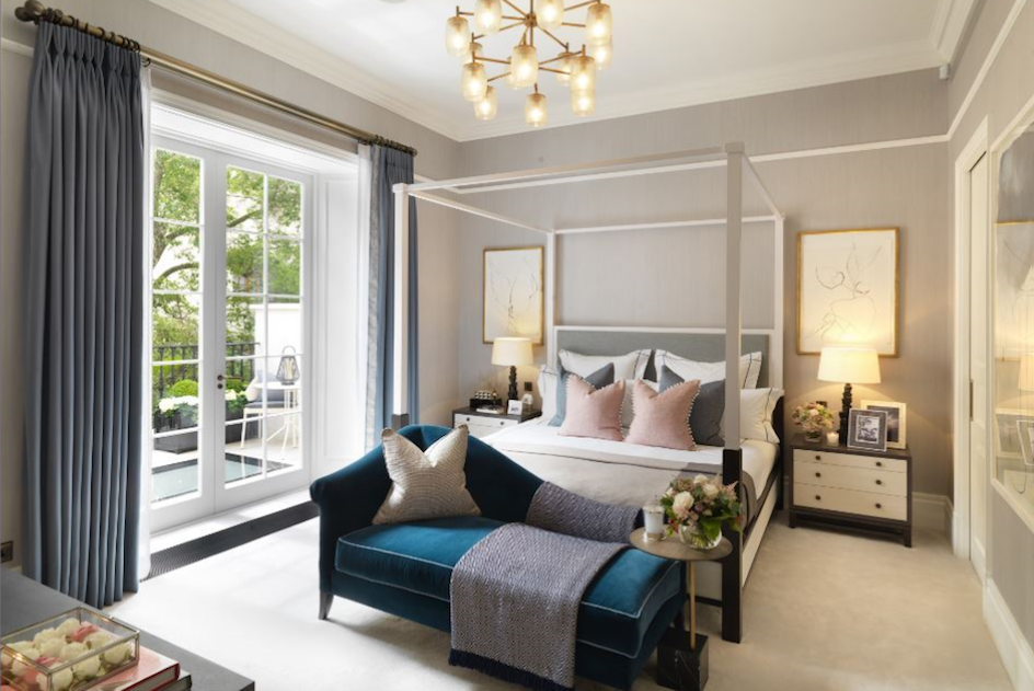
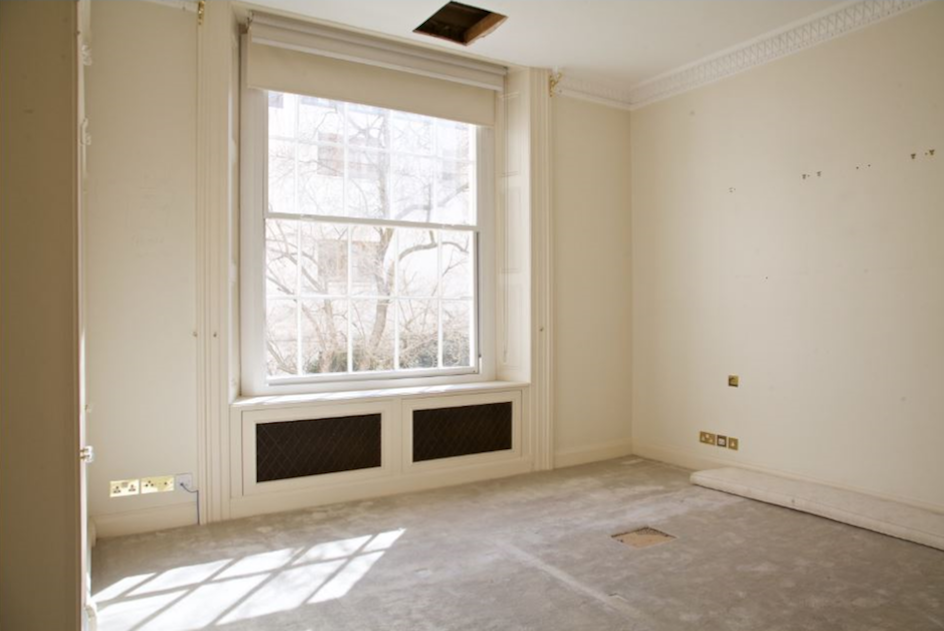
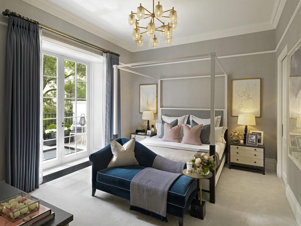
The final product is incredibly impressive and it is great to be able to share with our members the quality of real estate our investments help create. Scroll through the gallery below where you can see before and after shots of the reception, master bedroom and bathroom as well as the garden.
See below for interview with designers Carl and Harshida along with before and after images of the property.
The Sales Campaign for 14 Eaton Square has commenced and it is anticipated that the property will sell in the coming months. You can view a copy of the sales brochure here.
If you have any questions or queries do not hesitate to contact us on 020 3869 2620.
Carl Harris and Harshida Gadhiya Interview
What was your role in completing 14ES?
Carl Harris
I was the lead interior designer on the project. From the very beginning I created the concept and layout of the apartment, As the project progressed i worked through the detailed package such as the interior Architecture, Joinery, staircase, kitchen package and Landscaping. I specified the kitchen appliances and sanitaryware, and gave the setting out for all small power and lighting within the property. I designed managed the build on site, along with the project manager, while we both worked closely with all consultants and tradesmenHarshida Gadhiya
I was the project lead of FFE (senior designer) who oversaw the creative direction alongside a strong team of designers to deliver the project alongside a PM.
What was your inspiration?
Carl Harris
The style of the property was very early on set since the backdrop was Eaton Square, with the location and history in mind we wanted to reflect this opulent living within the interiors by highlighting a classical direction. To accentuate the grandeur of the property, on arrival the hallway walls were panelled with inset classical moulding and diamond cut carrara marble with satin brass inlay. The lower ground floor was transformed into an entertaining area with a large open plan reception room which lead onto the exterior terrace. The first few site visits were during the Spring season where we had a large cherry blossom tree cascading from the garden which was viewable from the master terrace. The fresh tones of the blossom tree was the start of what became the basis of the master suite, which complemented the brescia caprai book matched marble we laid in the bathroom.
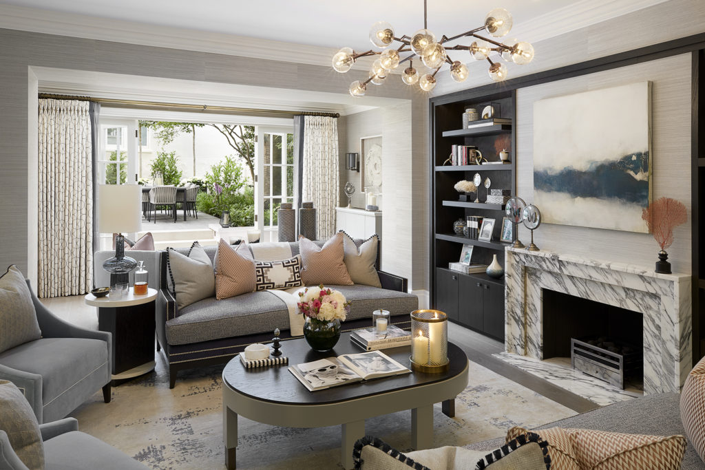
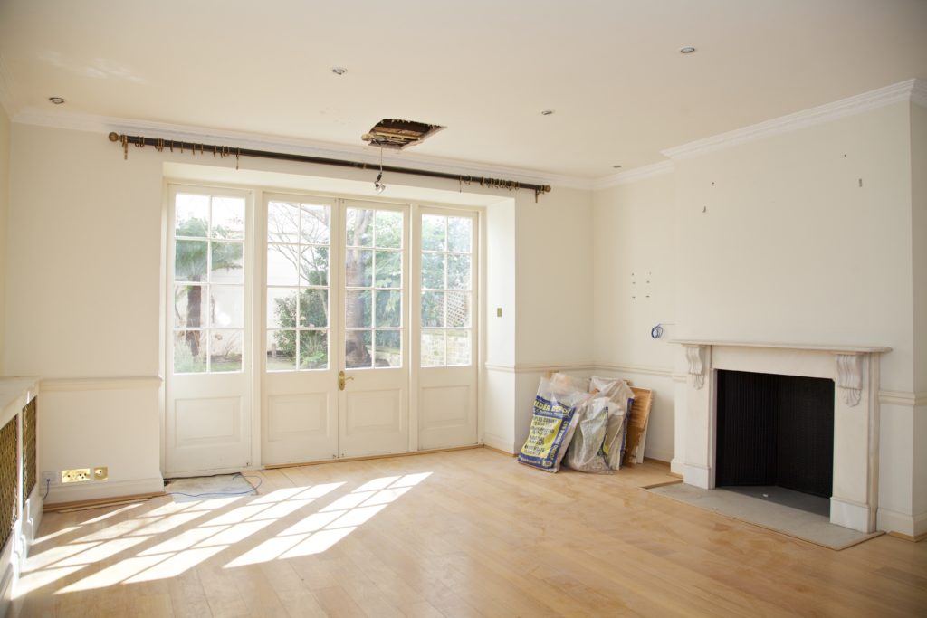
The Reception Room
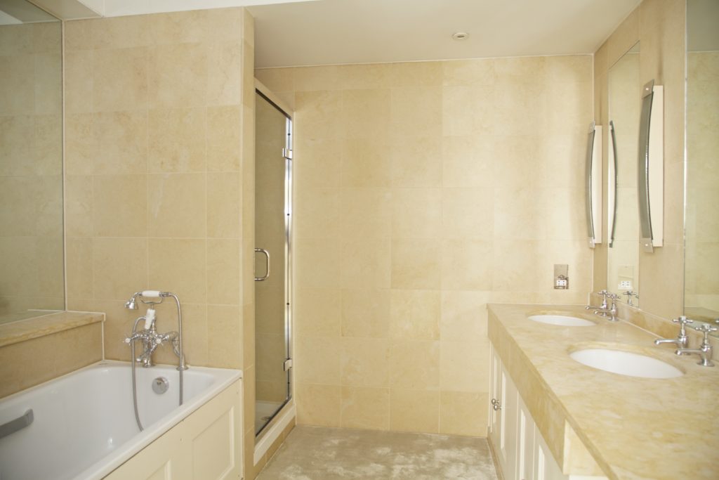
The Bathroom
Carl Harris
What is your favourite part of the project and why?
My favourite part of the project is the garden. The original garden looked tired and in need of a redesign. In London having your own private garden is a luxury, especially within Eaton Square. As such we wanted to make it a key feature in the house. We added pleach trees to maximise privacy and have an green garden all year round. There is a beautiful Cherry Blossom within the garden that blooms during March. The colour pink is striking and gives the space a unique character. We added four paned doors to the reception room to maximise the connection between the interiors and exteriors. As such the garden can be seen from many areas of the property and is a calming influence.
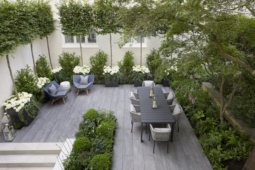

The Garden
Any interesting facts/thoughts on the attached before and afters?
The big gain to the project was on the Master Ground Floor Suite. Once we started the soft strip we released we had more floor area to work with. A large area of master en-suite/dressing was boxed in for no reason, so we were able to utilise this and create a bigger bathroom and dressing room. The layout and look of the master suite would have been considerably different to what it is today, had we not investigated the property fully. The lower ground floor chimney breast was also reduced to allow for a larger TV in the Reception Room. We maximised the ceiling heights in the Lower ground floor to make the space feel open and as high as possible. The Cherry Blossom in the garden is listed, therefore we weren’t allowed to build or dig to closely to it. This proved slightly difficult when setting out the garden. There were many planning requirements/stipulations within the property. One of which was that no spot lights could be installed in Bed 2 or Master suite ceilings. We therefore had to rely on feature pendants and wall lights to sufficiently light the space.
